Mastering color in your wardrobe is one of the most underrated, yet most powerful keys to a well-dressed style. For many men, choosing clothes often becomes a question of function: what is comfortable, neutral, and easy to wear. The result? A wardrobe filled with black, gray, and navy—safe choices, but also a limitation.
Learning how to match colors correctly doesn't mean you have to dress like a rainbow. Rather, it's about understanding how colors work together and how you can use them to highlight both your personality and your style. This guide will give you the basic principles and practical advice you need to build stylish, well-thought-out outfits—whether you're facing a workday, a dinner party, or a weekend activity.
Neutral colors as a base
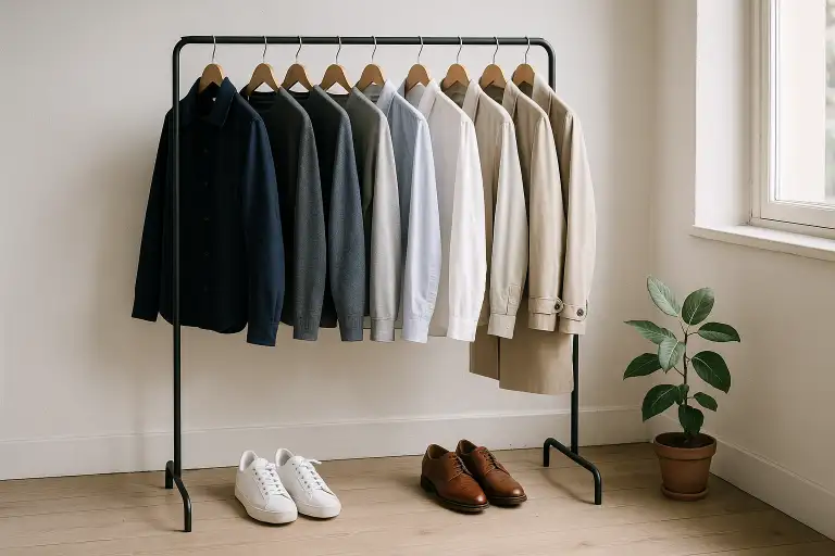
The first step to a well-thought-out wardrobe is to understand the power of neutral colors. These include black, white, gray, beige, brown, and navy. They act as the foundation of your outfit, as they can be easily combined with each other and with stronger accent colors.
A grey blazer, a pair of navy chinos or a white shirt are timeless building blocks that can be worn over and over again without getting boring. The secret is in how you combine them.
Neutral colors also signal a certain seriousness and professionalism. Navy blue and gray are often associated with reliability, while white stands for simplicity and purity. As GQ highlights in its color guide Neutral garments become the foundation that makes it possible to build flexible combinations, without risking style mistakes.
Build the outfit using the 50–40–10 rule
A simple and effective way to create balance is to use the 50–40–10 rule. It is based on dividing your outfit into three color parts:
- 50 % base color: usually a neutral color, which forms the base.
- 40 % secondary color: a complementary tone that adds depth.
- 10 % accent color: a detail that sets character.
Imagine an outfit with navy blue chinos (50 %), a light gray blazer (40 %) and a dark red handkerchief (10 %). The result is harmonious yet interesting.
This principle is often used in the fashion industry because it creates a balance between the safe and the exciting. Esquire describes how the proportions make even stronger colors easier to wear, as they do not dominate the overall look.
Tone-on-tone and monochromatic
If you want to keep it stylish but still vary your look, tone-on-tone and monochrome combinations are two safe ways to go.
- Tone-on-tone means that you use different shades within the same color family. Example: light blue shirt, medium blue blazer and dark blue jeans. The effect is soft and cohesive.
- Monochromatic goes even further: the entire outfit is based on one color, but in different shades and textures. An all-gray look can be very elegant if you mix different materials – for example, wool, cotton and suede.
These types of combinations are common on the catwalk precisely because they are easy to read visually. Ape to Gentleman shows how monochromatic outfits don't have to be boring – the secret is in using texture to create depth.
Contrasts and complementary colors
Where tone-on-tone creates harmony, contrasts bring life. One of the oldest and most effective principles for matching colors is to use complementary colors, that is, colors that are opposite each other on the color wheel.
Blue and orange, red and green, purple and yellow – the combinations may seem daring, but when used with muted tones the result is sophisticated. For example, a navy blazer with a burnt orange tie is both classic and dynamic.
Another contrast principle is to work with light and dark. A light shirt against dark trousers, or a dark polo shirt under a light jacket, creates a clear visual effect that enhances the proportions of your outfit.
Real Men Real Style highlights how contrasts also affect how you are perceived – sharp contrasts signal energy, while softer transitions give a more relaxed impression.
Accent colors: when, where and how
The accent color is often what separates a stylish outfit from a bland one. But here it's important to be restrained. A rule of thumb is to let the accent represent a maximum of ten percent of the overall look.
It could be a colorful tie, a pair of patterned socks, or a subtle handkerchief. The point is that the accent should add life without taking over. A gray suit with a white shirt can feel anonymous – but add a burgundy tie and you’ve instantly elevated the outfit several levels.
For more casual settings, you can wear sneakers in an unexpected color, or a knit sweater in a strong tone, but keep the rest of your clothes neutral. According to FashionBeans Restraint is the most important rule for success with accents – when there are too many, the outfit loses its balance.
Matching accessories: leather and metals
One of the most common style mistakes men make is not thinking about the colors of their accessories.
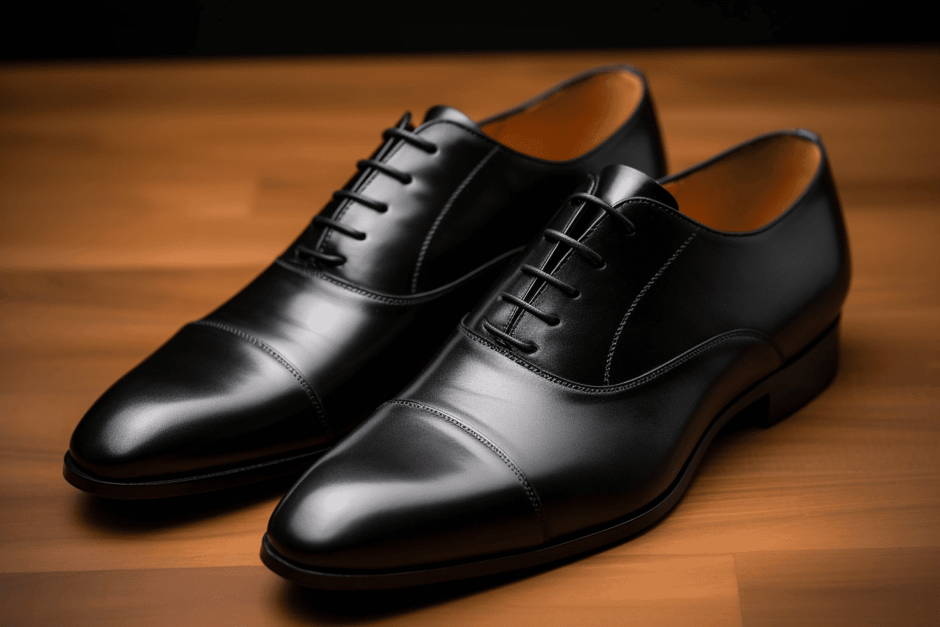
- Leather: Your belt and shoes should always match in tone. Black shoes require a black belt, while brown shoes work with anything from cognac to dark brown belts. Leather bags and watch straps should also stay within the same color range.
- Metals: Silver and steel go best with cool colors like gray, blue, and black. Gold harmonizes better with warm colors like brown, beige, and green.
These are small details, but they determine whether your outfit is perceived as well-thought-out or sloppy. The Art of Manliness emphasizes the importance of seeing accessories as part of the larger color palette – not as separate accessories.

Color psychology and personal color palette
Colors affect how we are perceived by others, so understanding color psychology can help you choose clothes that send the right message.
- Blue: professional, reliable, calm.
- RED: energy, passion, authority.
- Green: balance, naturalness, harmony.
- Black: power, formality, elegance.
- White: simplicity, purity, neutrality.
In addition to this, your own features play a role. Skin tone, hair color and eye color determine which colors bring out you best. According to DMARGE Warm undertones look best in earthy colors like olive green and beige, while cool undertones look better in navy blue, gray, and burgundy.
By mapping your personal color palette, you can build a wardrobe where each piece interacts with the rest – and with you.
How to find your balance
Matching colors isn't about memorizing rules and blindly following them. It's more about understanding the basics and then practicing applying them.
A good first step is to start simple: build outfits around neutral base pieces and add one or two secondary colors. Then add an accent piece and see how the whole thing changes. Over time, you'll notice which combinations feel natural to you, and which ones stand out in the wrong way.
Also remember that fashion is not static. Trends change, but a well-constructed color palette in your wardrobe stands the test of time. By combining classic colors with subtle accents, you can create a style that feels both timeless and personal.
Summary
Matching colors in clothes doesn't have to be complicated. By:
- Use neutral colors as a base.
- Build the outfit using the 50–40–10 rule.
- Switch between tone-on-tone and contrasts.
- Keep accent colors subtle.
- Let accessories follow the same color logic.
- Take advantage of color psychology and your personal color palette.
...you can create outfits that feel both harmonious and interesting.
The key is not to follow every rule to the letter, but to understand why they exist and then adapt them to your style. Next time you’re in front of your closet – try adding an accent, or swapping a neutral for a complementary color. Small adjustments can make a big difference.